27
Bregenz Hafen glass graphics
A visible code, an encrypted text
| Title | Bregenz Hafen glass graphics |
|---|---|
| Year | 2010 |
| Client | State Capital Bregenz |
| Architecture | Planungsgemeinschaft Hafen Bregenz, Nägele Waibel - Spagolla - Ritsch |
| Text | Otto Kapfinger |
| Symbol generator | Systementwicklung Wien |
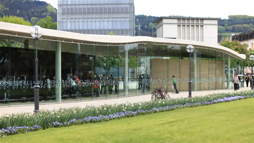
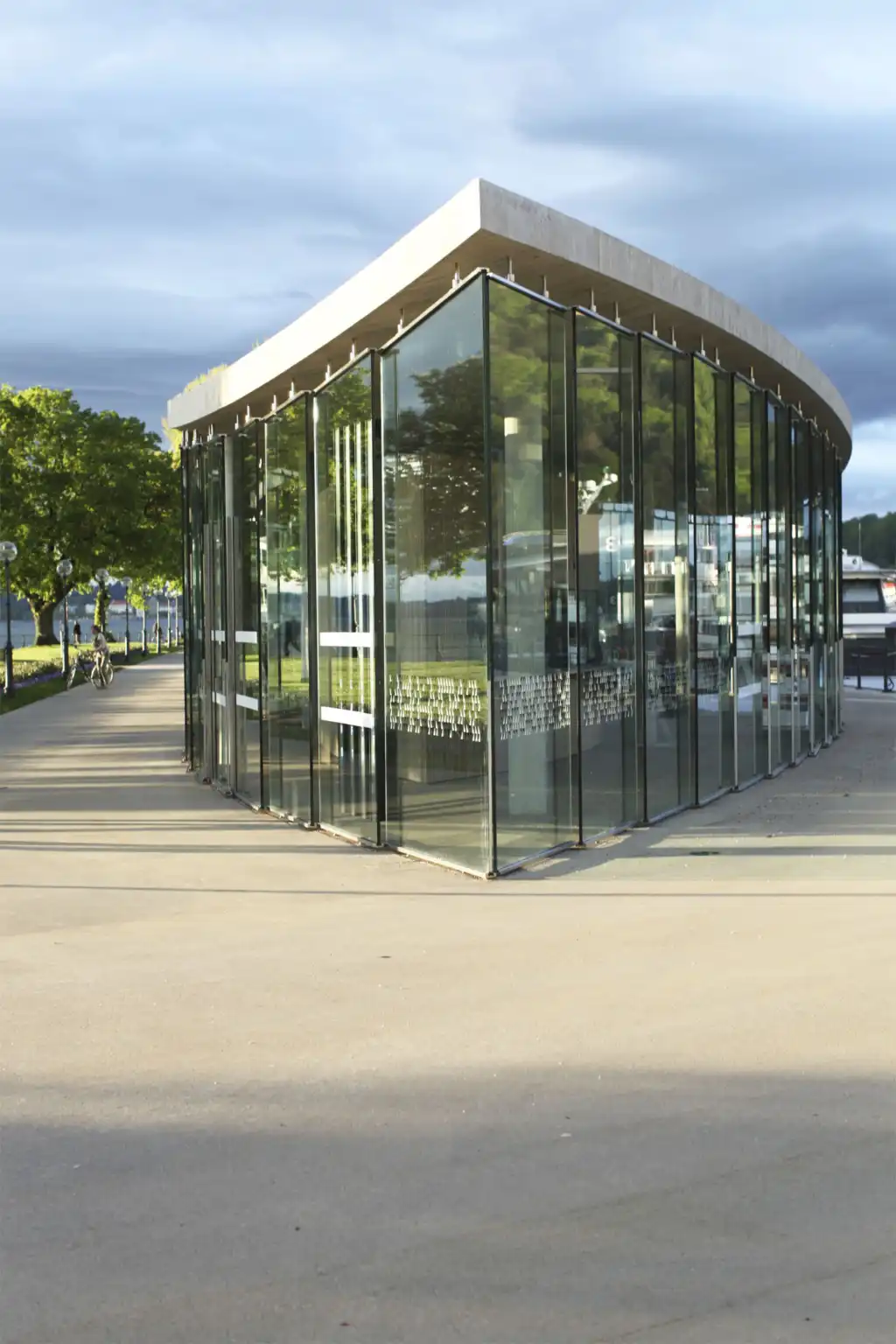
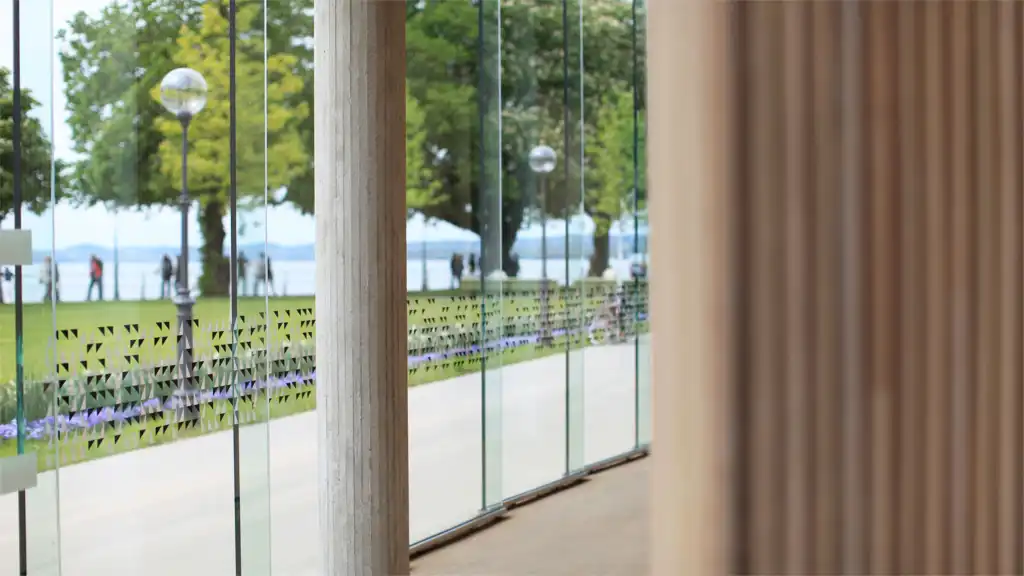
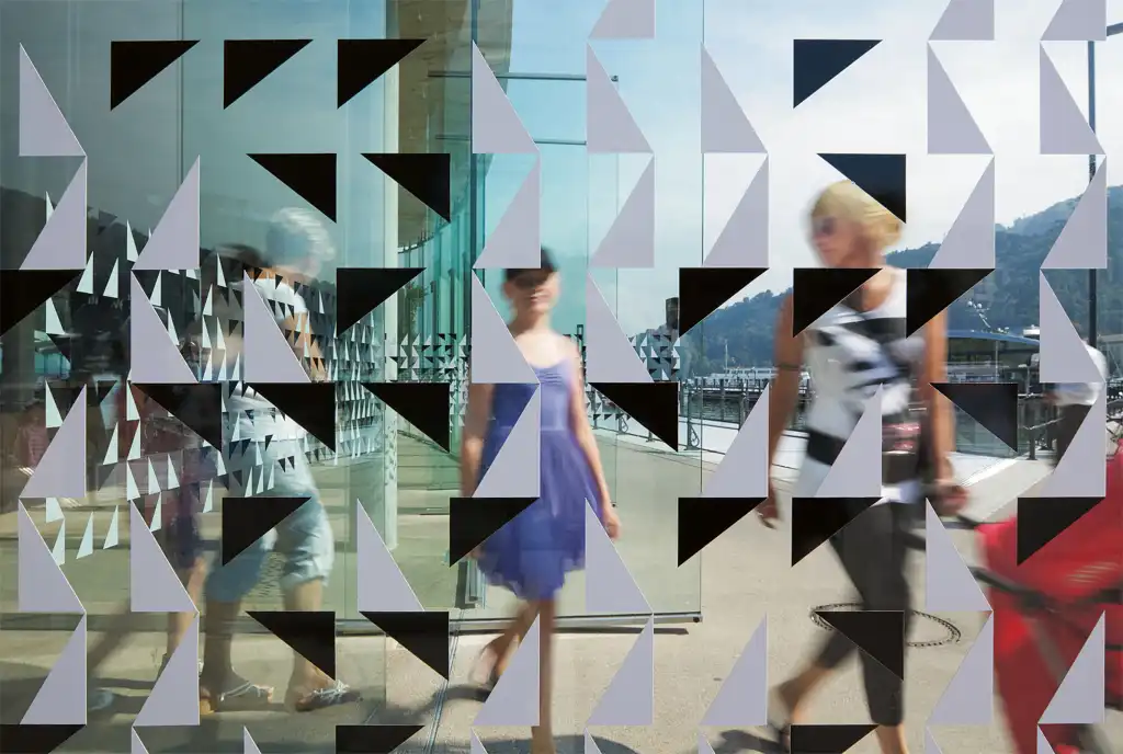
For the Hafengebäude (harbour building) of the City of Bregenz an effective visual screen for 80 bays of full-height glazing was to be developed that would not impair the transparency of the building envelope. The starting point was provided by the need to interrupt the transparency, every 5 x 5 cm in black and white, with bars 2 cm high, for a certain viewing height.
The basis for the concept is provided by band of text in the shape of a rhythmical, graphical system of symbols of an abstract binary basic code; instead of 0/1, black and white are used in the form of a boustrophedon cuneiform script. The text, which deals with the theme of glass and transparency and was written especially for this purpose, remains encrypted. Ultimately, what one sees are apparently randomly varied ornaments and a mysterious pattern. Our lives are increasingly determined by a communication system which essentially consists of two symbols and is generally concealed from us. The concept is based on making this system visible and, with it, the rhythmical structure and order of the text. An extract from the text: “ … comparable to the phenomenon when the reflective surface of the lake, fleetingly moved by wind and waves, acquires this fascinating shimmering quality that meditatively captures the eye and at the same time relaxes it…”
Below the full deciphered text:
In architectural parlance transparency is primarily associated with glass simply because we can look through it. But from outside, during the day and in the sunshine, large areas of glazing in buildings are never completely transparent. Through the reflection of the sunlight, the way the surroundings are mirrored glass buildings or glazed building parts can seem extremely massive, indeed hermetic, and from certain angles even dark and monolithic. From a distance, due to their reflective quality, they are highly noticeable, radiating space as it were, glittering like crystals. The idea of using digital patterns to break up the aggressive mirroring effect of such glass facades makes sense from a number of perspectives and is helpful in both design and functional terms: the ornament defuses the monolithic brilliance of the facades, giving the eye areas on which it can focus, whereas excessive transparency would create a safety problem in using the building. The crystalline surfaces relax in a pattern that introduces a certain grain, a suggestion of texture. A multi-dimensional layer is placed over the essentially mono-dimensional quality of glass, which creates a visual distraction and in semantic terms adds new layers and effects to the simple reflective aspect. In this way the material, whose surface repels everything, both visually and factually, is given a certain depth. The irritating aspect of the external effect is permeated, visually opened up for contrasting characteristics, more complex layers of meaning. Thanks to the printed pattern the architecturally intended transparency, the visual lightness of the building’s external and internal impact are retained, indeed even strengthened, as the reflective effects are limited, defused so to speak. In the harbour building the concern is the effect of lightness, dematerialisation, ultimately also of glass, which can best be achieved by ornamentation. With a pattern of this kind the glass of the building can relax in a pixel effect, comparable to the phenomenon when the reflective surface of the lake, fleetingly moved by wind and waves, acquires this fascinating shimmering quality that meditatively captures the eye and at the same time relaxes it…”


