121
Familiar sign, reinterpreted
Corporate Design Apotheke Tosters
| Title | Familiar sign, reinterpreted |
|---|---|
| Year | 2022 |
| Client | Apotheke Tosters |
| Production | Buchdruckerei Lustenau GmbH |
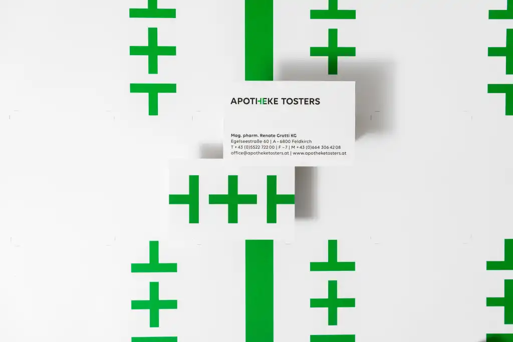
There are a few consistent symbols used for visual identification of pharmacies. We often see the serpent’s staff, originally the attribute of the god of medicine (Aesculapius) – sometimes used in relation to a stylized apothecary’s scale or twisted into the capital letter „A“ for the Austrian Chamber of Pharmacists. Internationally however, a green cross is commonly used to signify pharmacies and medical areas. This symbol serves Atelier Andrea Gassner as a visual building block for the appearance of the new pharmacy in Feldkirch-Tosters. Formal elements of the green cross are interwoven in the lettering „Apotheke Tosters“ itself, forming a striking word and picture mark.


