59
lehmo
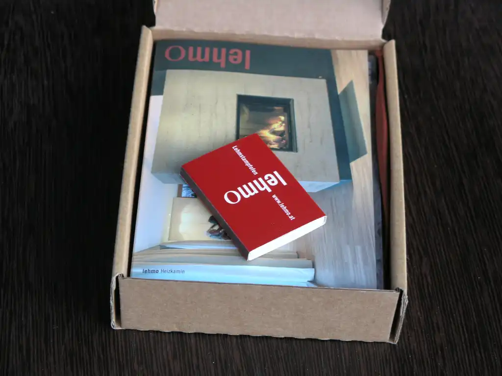
A tile, a stove
| Title | lehmo |
|---|---|
| Year | 2004 |
| Client | lehmo |
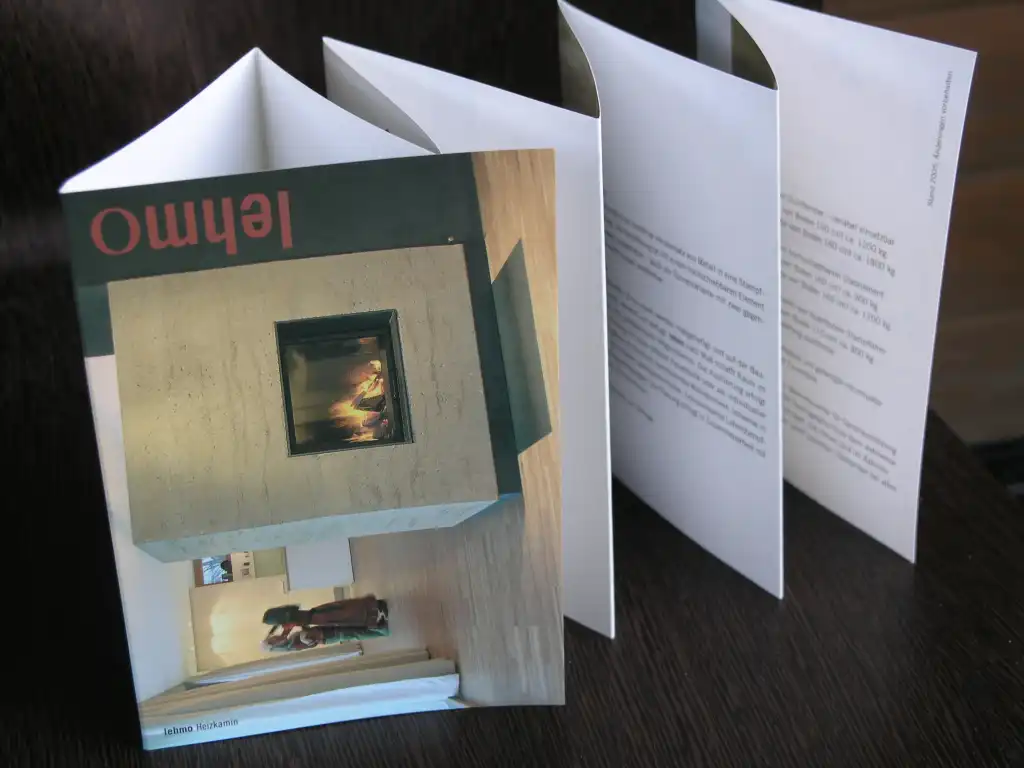
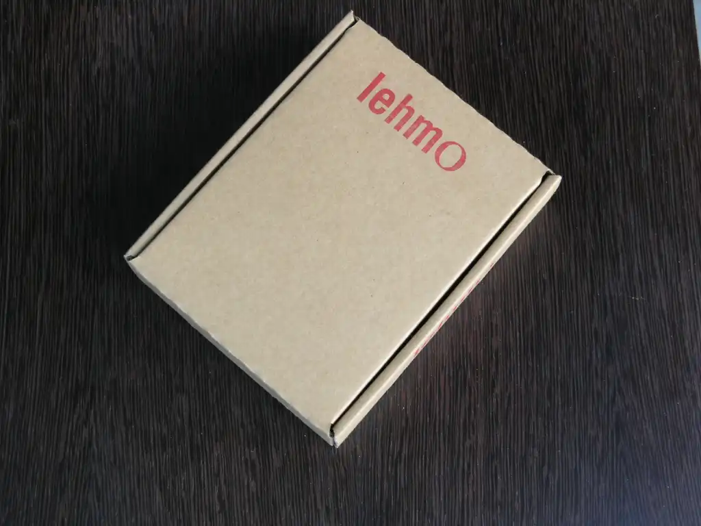
A monochrome logotype: the word “Lehm” is set in the Grotesque font, Trade Gothic bold condensed, whereas the “o” is in an Antiqua (font type: New York). The Antiqua makes the “o” resonate and creates exciting contrasts between traditional and modern, filigree and stable.
Reinhard Gassner


