57
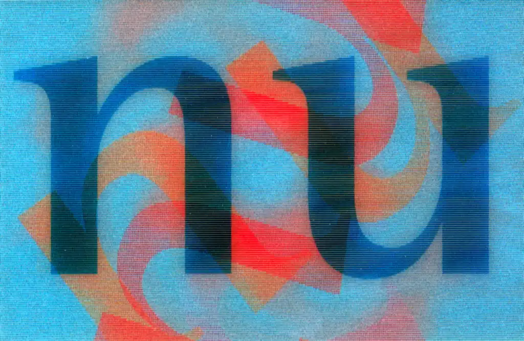
nu
Two letters, one letter form
| Title | nu |
|---|---|
| Year | 2003 |
The task was to design a name and appearance for a software company.
The company’s dual track character is programmatic: on the one hand it offers high-tech content management systems and on the other creative, but standardised, software solutions. In a workshop with the client it was decided to use a freely invented onomatopoeic name.
The solution consisted of two letters, actually just one form of letter that stands alternately on its feet or on its head – nu – n and u, not u and n, which would have had a far more negative connotation; the dynamics and the combined effect of the letters harbours numerous meanings, nu functions like a kind of acoustic pictogram, which is due to the familiar and yet at the same time unfamiliar quality of this name. It is too short to be abbreviated, it awakens curiosity and relates to the number two. This association is played with visually with by swivelling the letters in the logotype and in other applications – 2 colours with 2 x 2 letters that, when overlaid, produce new forms and colours.
