99
Philosophicum Lech
Website
| Title | Philosophicum Lech |
|---|---|
| Year | 2018 |
| Client | Gemeinde Lech am Arlberg – Verein Philosophicum Lech |
| Editorial office | Mirjam Fritz |
| Collaboration | Bernd Altenried, Lindau |
| Programming | Christoph Kapeller, Lech |
Atelier Gassner’s corporate design for Lech municipal council has proved its worth over more than 25 years and is widely used: from the letterhead and all the council’s
printed material to the signposts throughout the village. The goal was to create a contemporary image that would, however, be independent of the tourism advertising.
Alongside the coat of arms derived from heraldry, the basic element of the corporate design is a family of typefaces known as Trinité, a modern Renaissance Antique by Bram de Does. The set of characters comes in three different versions that are distinguished by their different upper and lower lengths. These variables and other coordinated type styles allow precise typographical differentiation for a variety of applications – from the council’s correspondence to the bibliophile typesetting, from the town’s extensive signposting system to its web design.
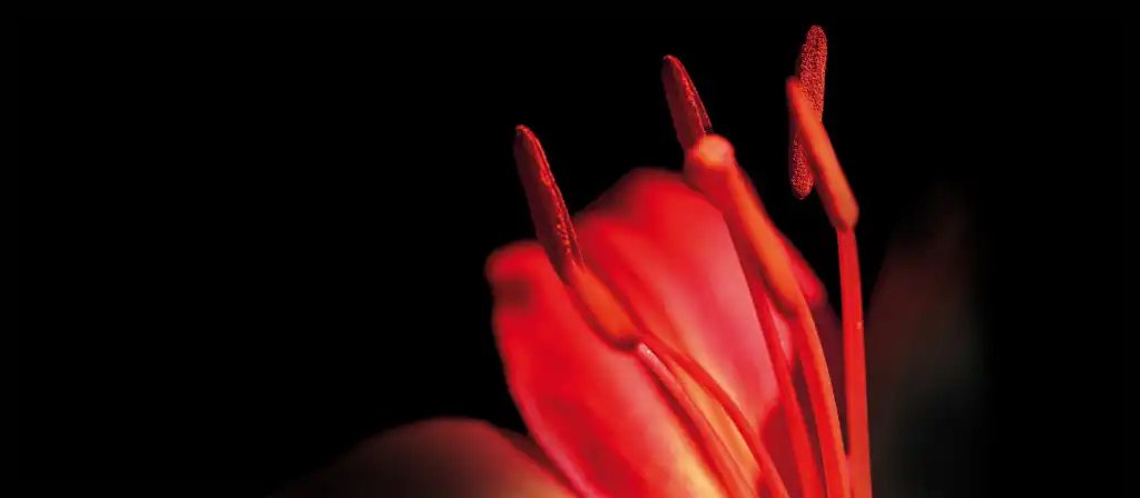
The digital and analogue design for the “Philosophicum Lech” is based on this typeface culture and is connected with a unique image concept. Using microphotography, the theme of the year is expressed by a different kind of plant each year. In this way the “key visual” is renewed year after year, while still remaining a recognisable events label.
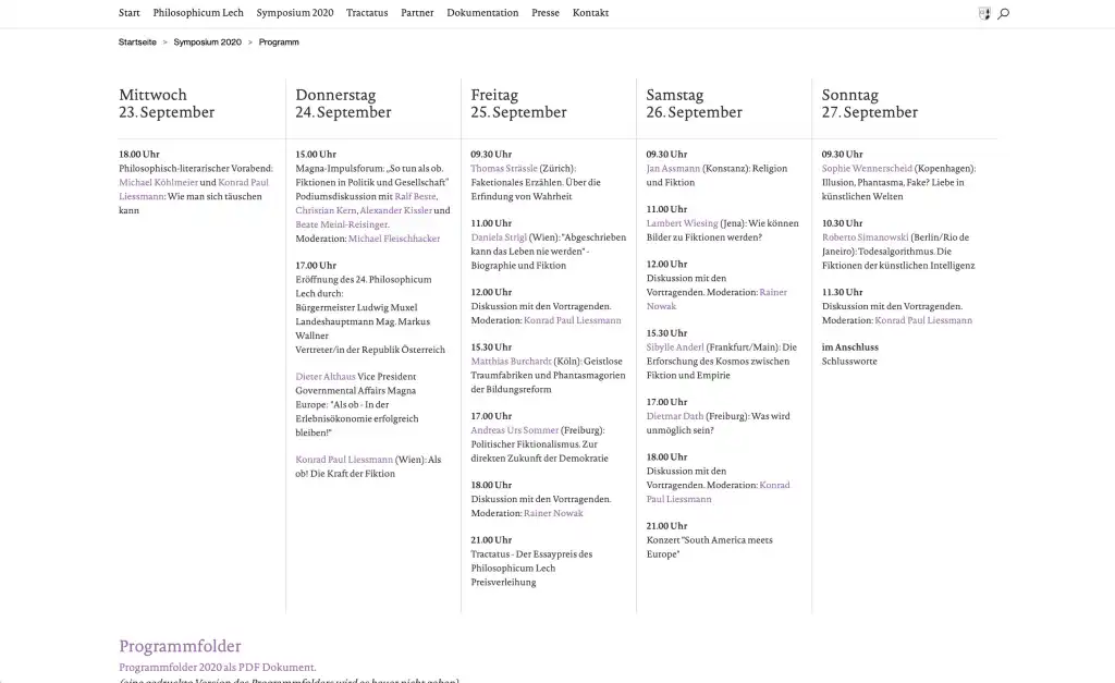
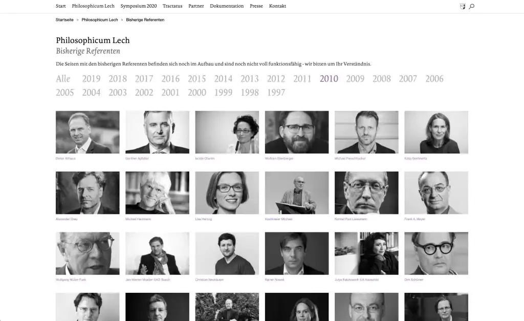
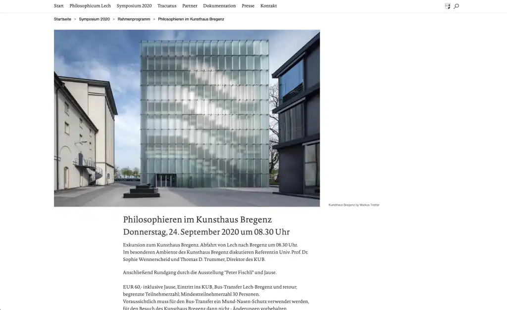
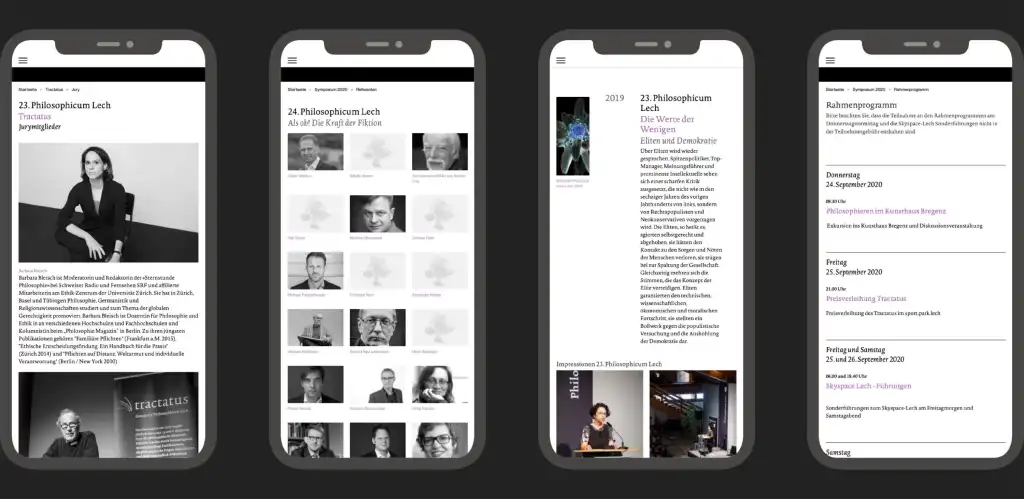
The website fulfils several functions. It is an archive, advertising for events and at the same time a commuication platform for the organisers of events. The web design ensures a bright, uncluttered website that responds flexibly to the particular end device used, above all smartphones and tablets.
