112
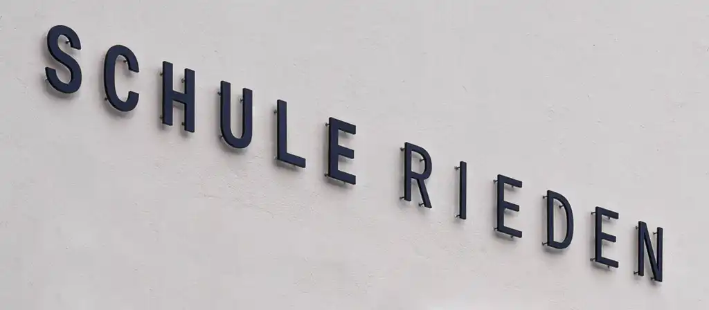
Signage for Rieden School
| Title | Signage for Rieden School |
|---|---|
| Year | 2020 |
| Client | State Capital Bregenz |
| Production | Mader Werbetechnik, Lauterach |
| Architecture | Otto Gruber und Ernst Hiesmayer |
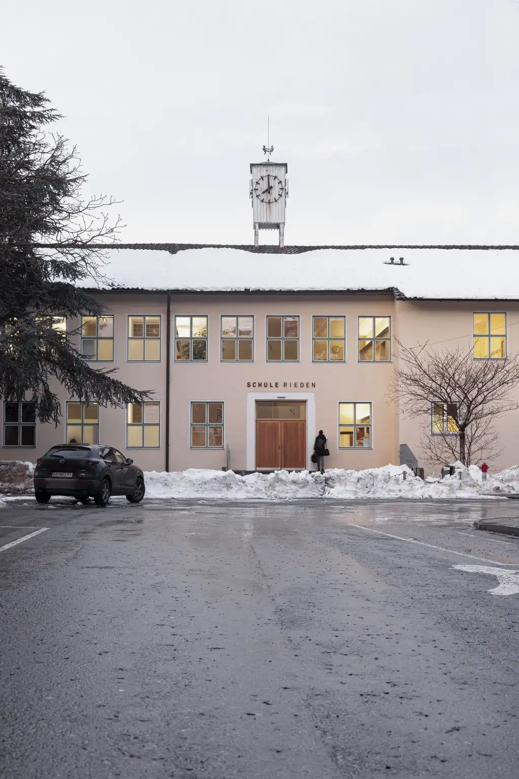
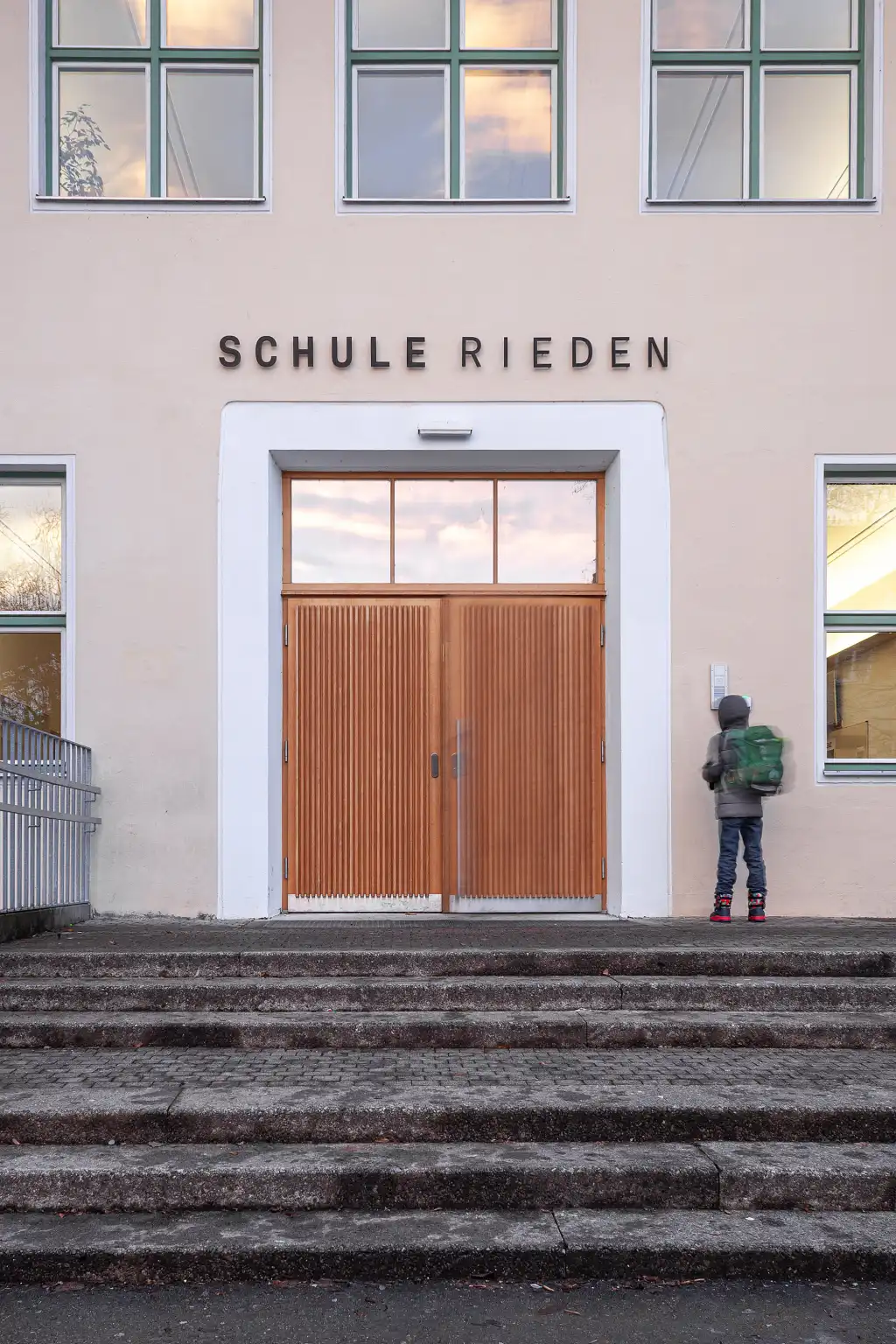
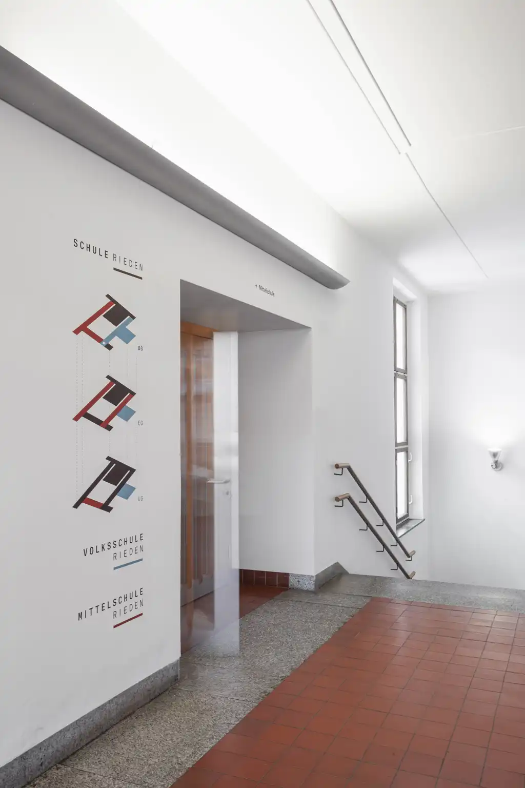
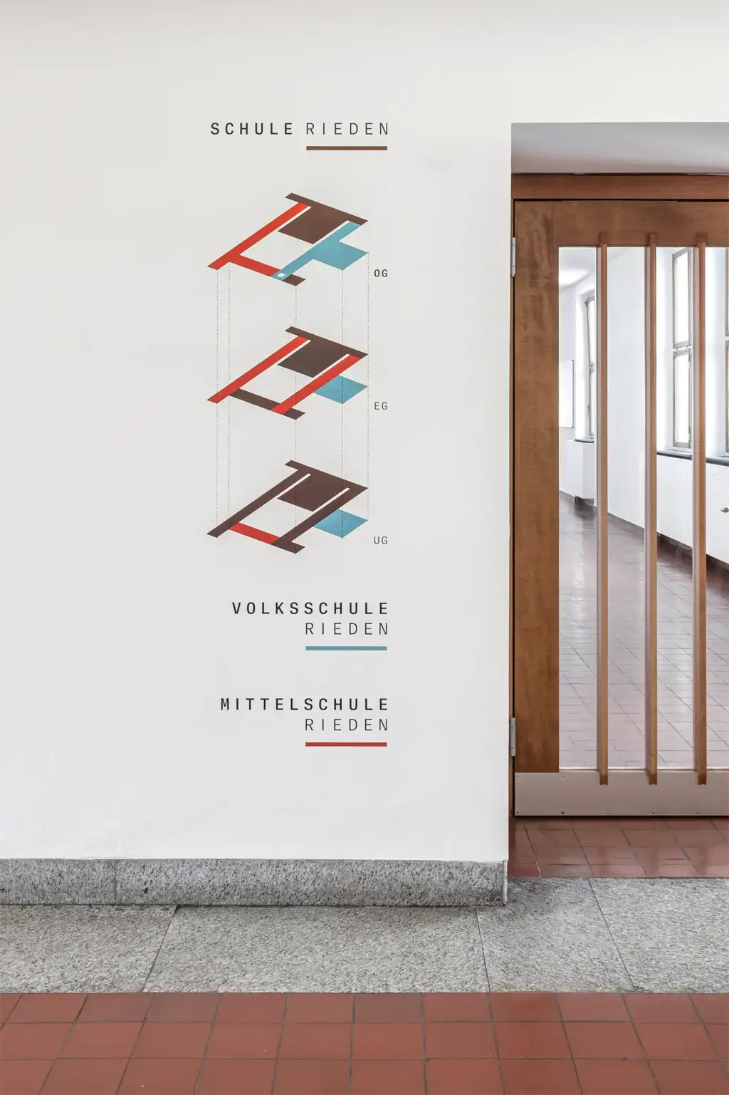
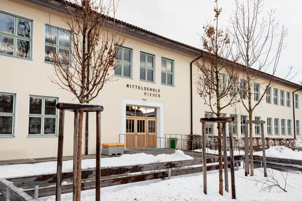
Rieden School is made up of Rieden Primary School and Rieden Middle School, which are housed in two independent but connected building volumes. While the two school areas are essentially spatially separated, they come together in the rooms that are used jointly such as the gym, library, cafeteria, and administration. The aim, therefore, was to create clear signage and, using just a few accents, to provide easily understandable directions and routes within the school – starting with the school name above each of the three main entrances.
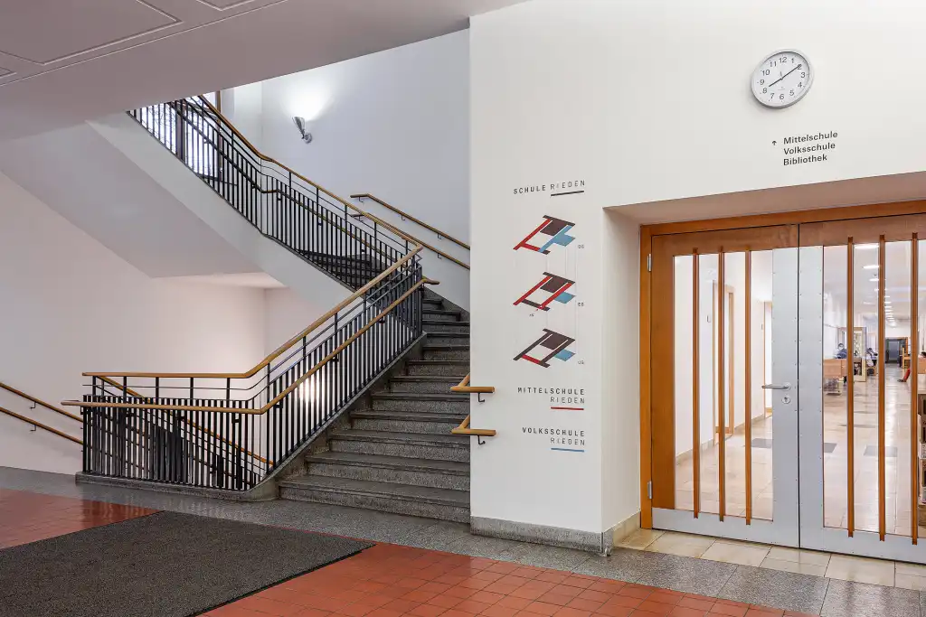
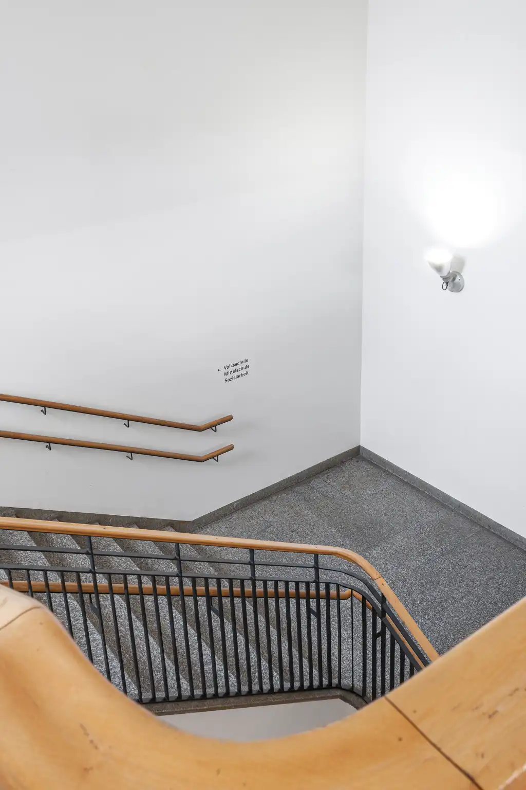
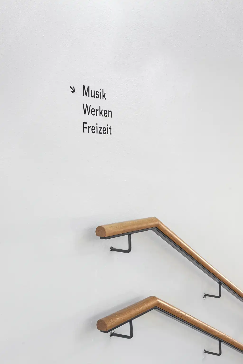
The principal design elements are the nomenclature based on easily understandable terms, differentiation by means of colour, and spatial pictograms that employ the plans of the different storeys. Mixing the light blue for the primary school with the red of the middle school produces a rich shade of brown, which is the primary decorative colour in Rieden School. The colour concept borrows from the colour moods and the materials inside the building. Placing the lettering and illustrations directly on the walls obviates the need for additional panels and offers the requisite flexibility in choosing suitable positions for signs and names at important junctions.
