12
zuschnitt
Architecture and timber building magazine
| Title | zuschnitt |
|---|---|
| Year | 2000 |
| Editor | proHolz Austria, Wien |
| Project lead | Christina Simmel |
| Length | 28 pages, appears four times annually |
| Awards | ISTD International Typographic Award |
| Circulation | 12.000 |
| ISBN | 978-3-902320-91-9 |
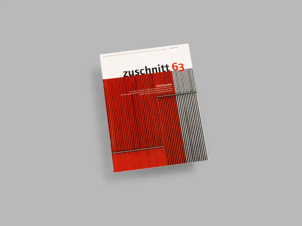
This top magazine from proHolz Austria presents decision-makers, architects and designers with the current trends in timber building at the highest level. Four times each year it brings important information on form, material and construction, theory and practice, timber research and timber construction in the form of interplay between the various disciples. Acceptance, reading frequency and intensity remain at a constantly high level.
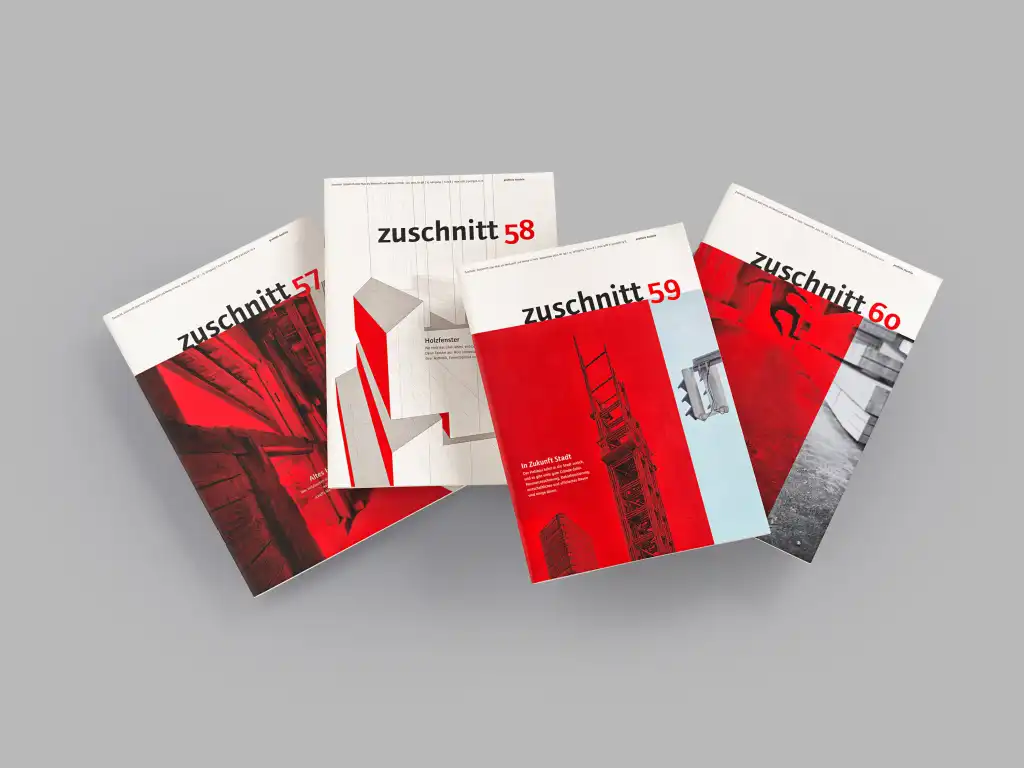
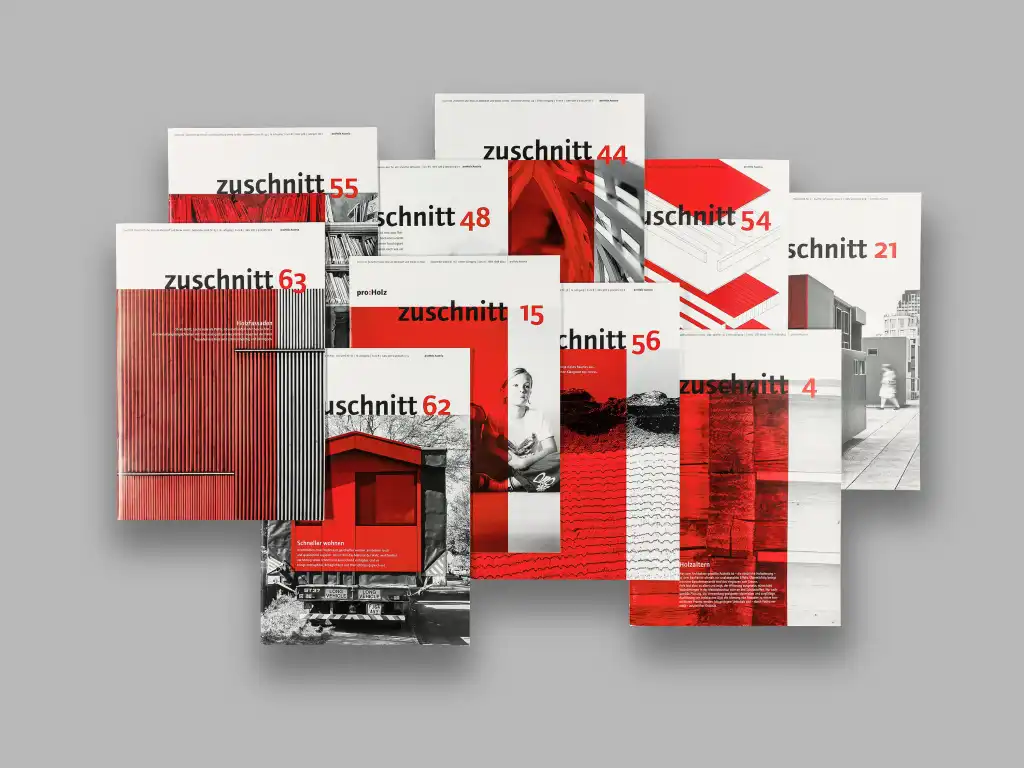
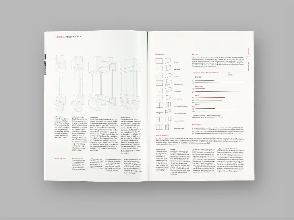
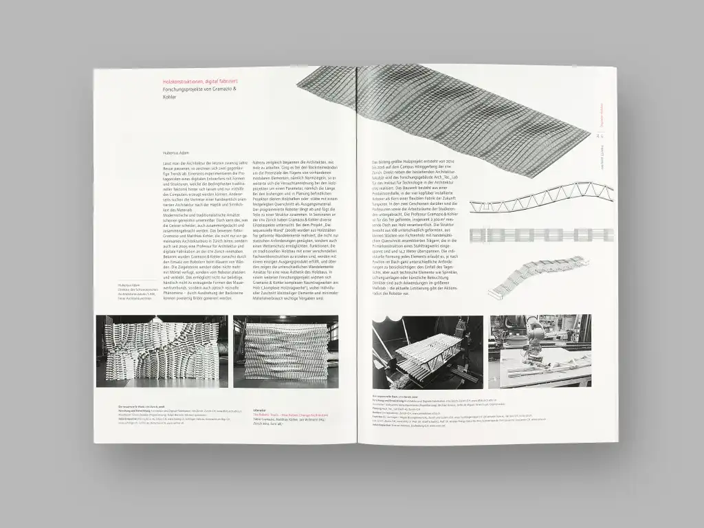
“zuschnitt” has proven its value as an important element for communication between the specialist public –a magazine about timber as a material and buildings in timber that focuses consistently on the target group of planners and decision-makers. Great attention is paid to the quality of the contents. The visual design of the magazine responds to these aspirations with bibliophile design and implementation. In order to distance itself from the “colour intoxication” that dominates communication media today the reproduction is deliberately restricted to black and white lithography. The inside pages are cleanly and editorially organized with, in part, an emphasis on the text. The impression of advertising is deliberately avoided. Independent surveys have convincingly confirmed the success of this medium in terms of attention, reader-magazine relationships and image. In addition to dealing with factual themes a number of issues are marked by design and poetic intentions. For example issue 16 examined “timber in language and timber as language” – it was deliberately designed without photography. Here things are precisely the other way around: the images are placed in the texts and in the typographical design – Pinocchio’s nose across several pages, a flow image with hundreds of different names of types of wood etc. In the title, too the usual image is avoided and a structured red surface is printed in letter printing with a wooden block. The structure of wood is visible and tangible.
“No matter whether it is in the field of architecture or communication, choosing a certain material for a design application means incorporating its function and its character in the design. Beneath the surface of what is purely visible deeper significances of image and things are concealed. Why does something appear to us to be dry, bombastic, dusty, romantic, modest, unappealing or attractive? How can we, as designers, deal with this? The language of the material wood is varied and it can be experienced in a sensual material way; these are not artificially produced surfaces but appearances that develop from the life of the tree.”
Reinhard Gassner
