allesamt
Interactive Signage for Children – Orientation with Fun
| Title | allesamt |
|---|---|
| Year | 2024 |
| Client | Gemeinde Nenzing |
| Architecture | Christian Schmölz Architekt |
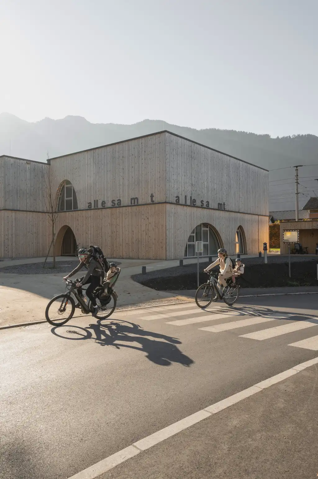
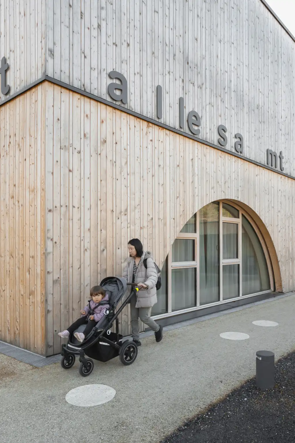
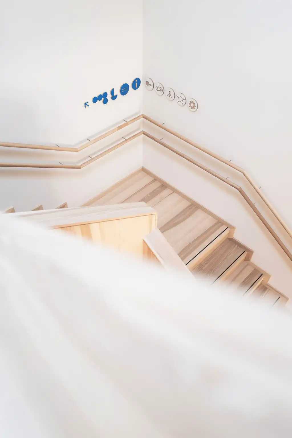
The circle plays a significant role in the new family center of the Nenzing community—whether in the fairy-tale-like architecture with its rounded arches on windows and doors, or in the guidance system featuring pictograms and elements specifically designed around circles. The facility is called "allesamt." This name, developed during a workshop with the client, has a pleasant ring, feels familiar, and conveys the essence of the community's vision: inclusiveness. It welcomes all the village's children, as well as their parents. The "allesamt" lettering is prominently placed on the building's street-facing edge. The seemingly random spacing between the letters—both large and small—mirrors the rhythm of the façade's design, transforming the name into a logo and emphasizing its phonetic charm.
Pictograms as Play
For concise and memorable room labeling, the center uses names derived from local community parcels and an abbreviation-based counting rhyme familiar to children:
"Be La Gu – Ro Ha Ru – Mo Ma Hei – und du bisch frei!"
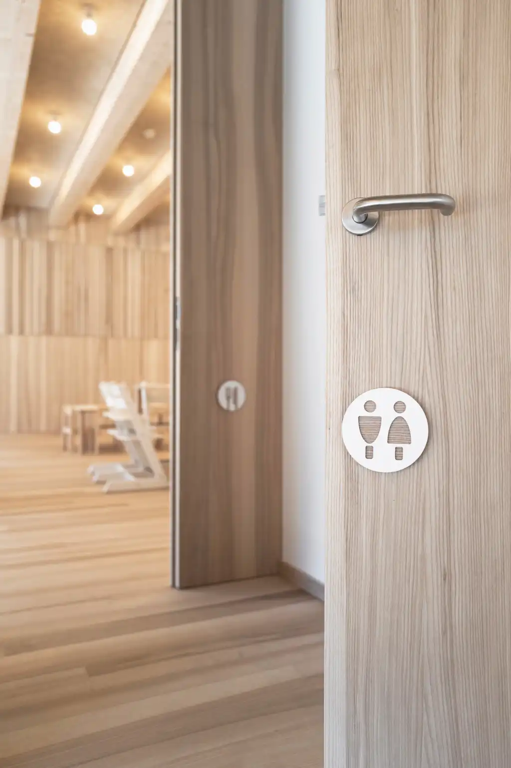
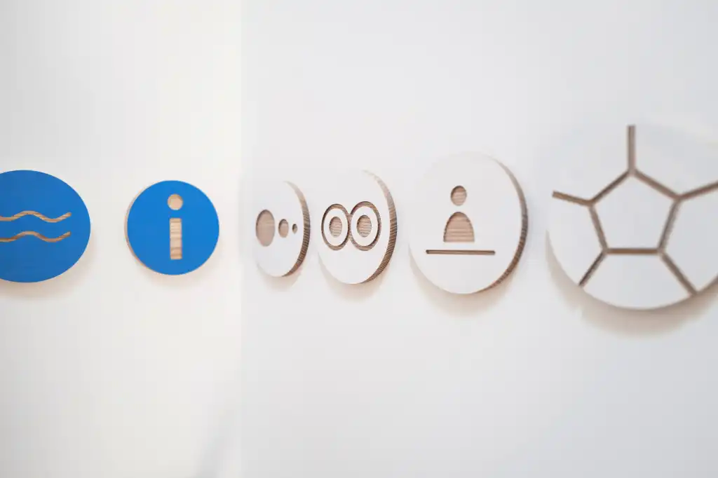
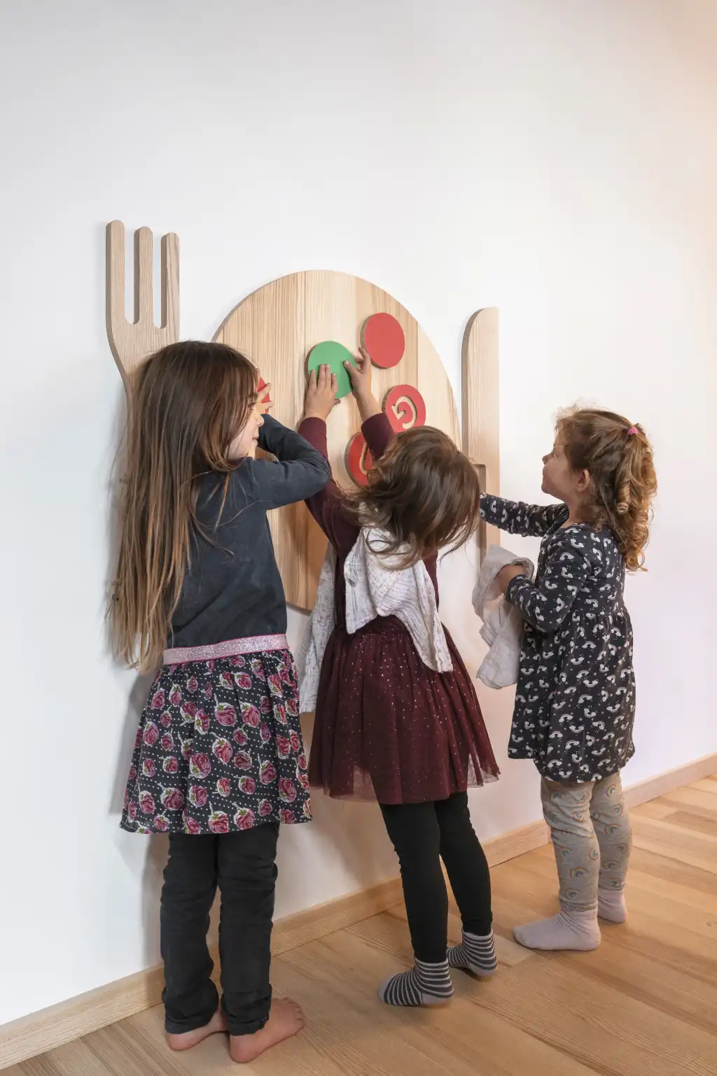
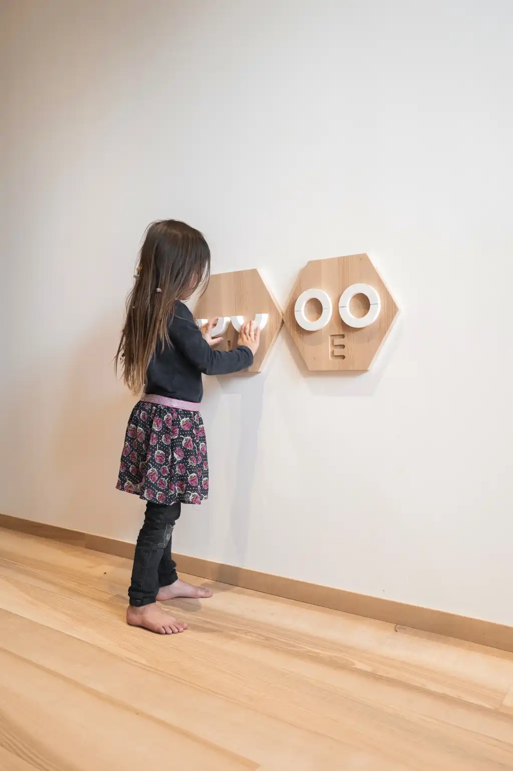
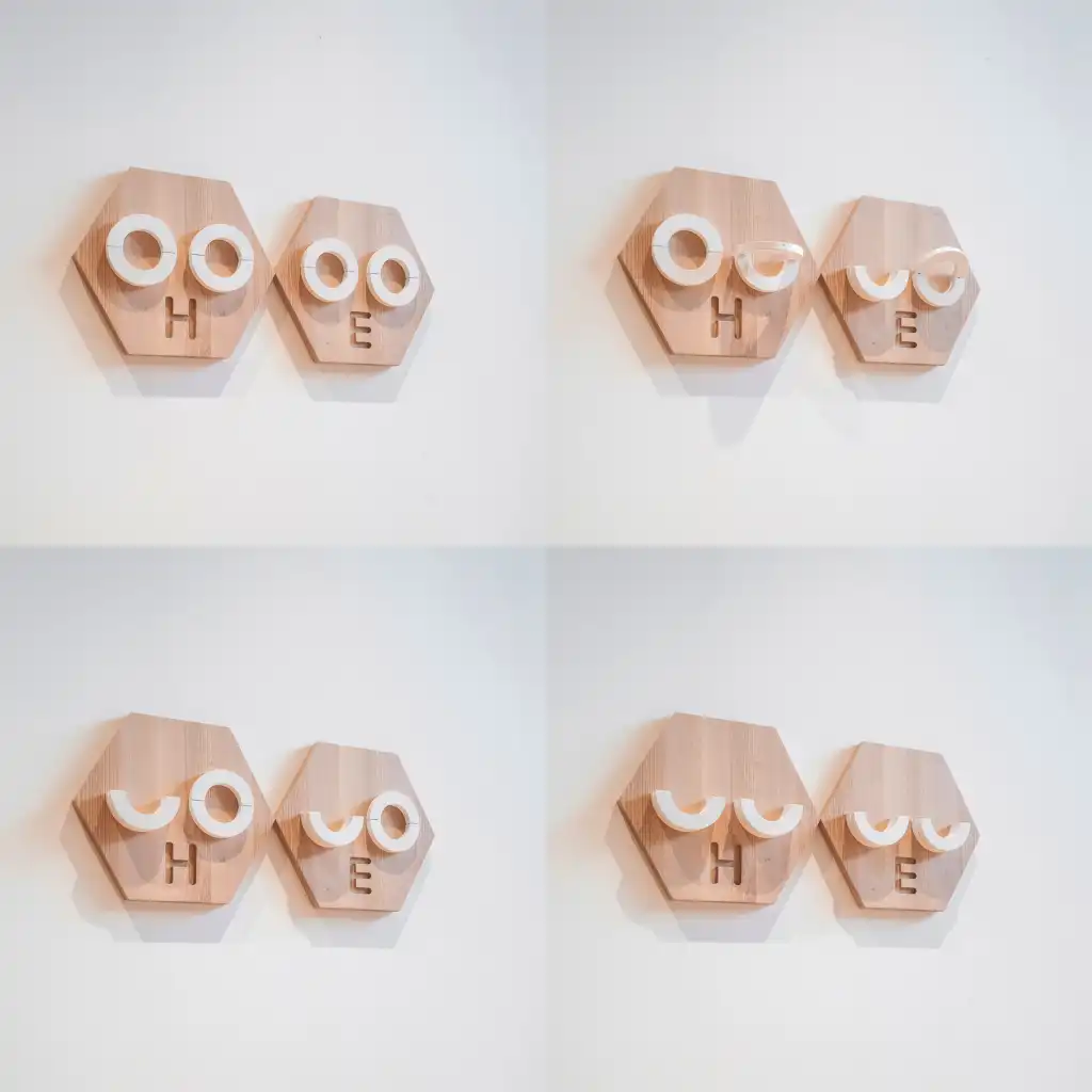
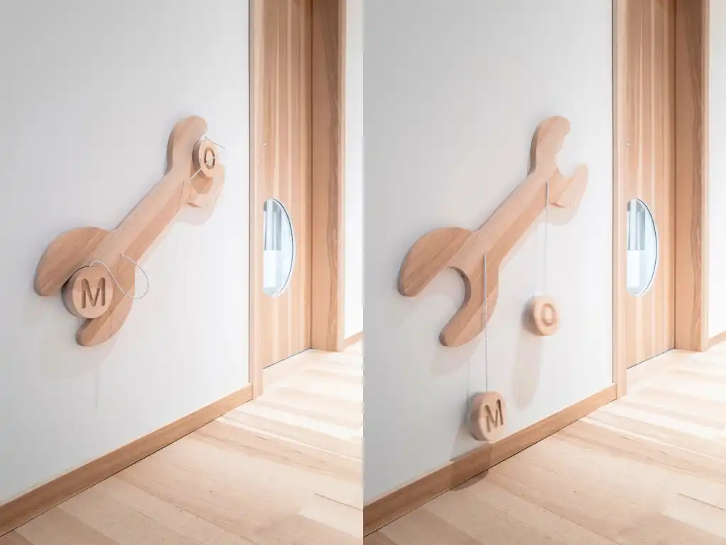
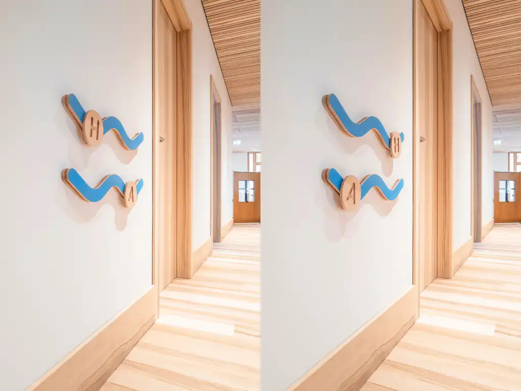
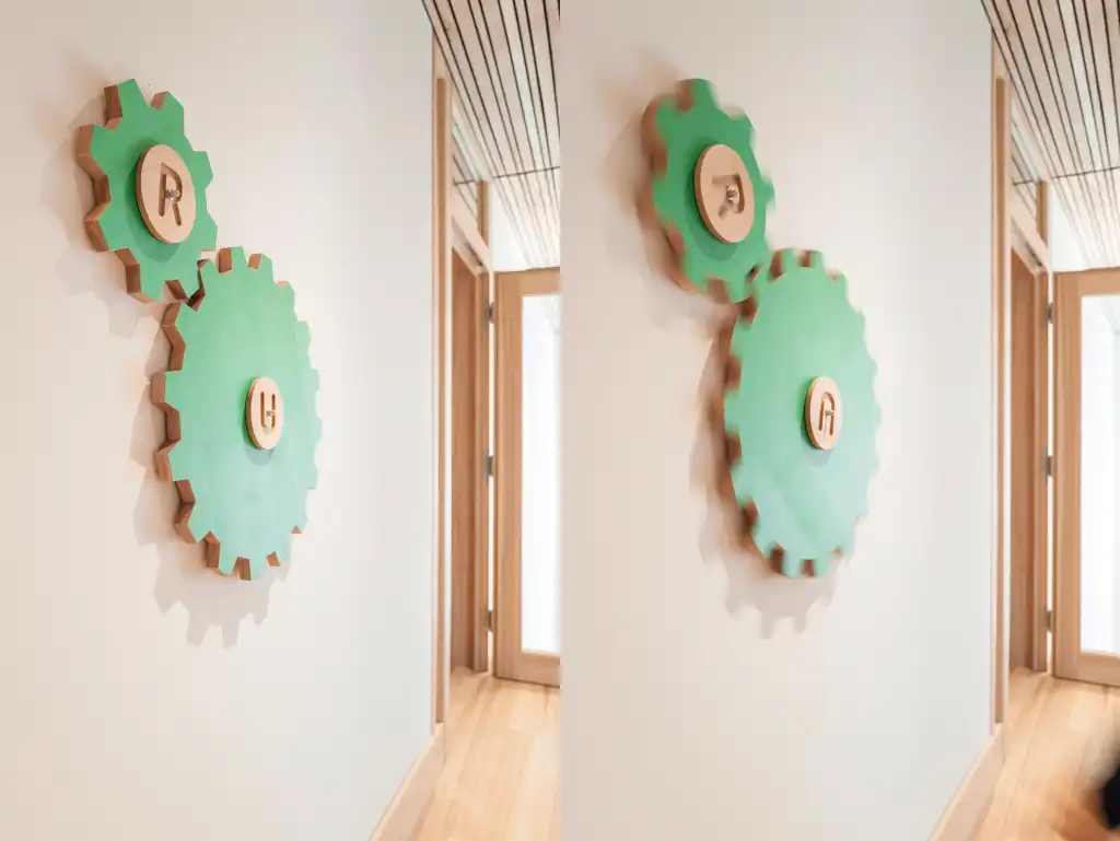
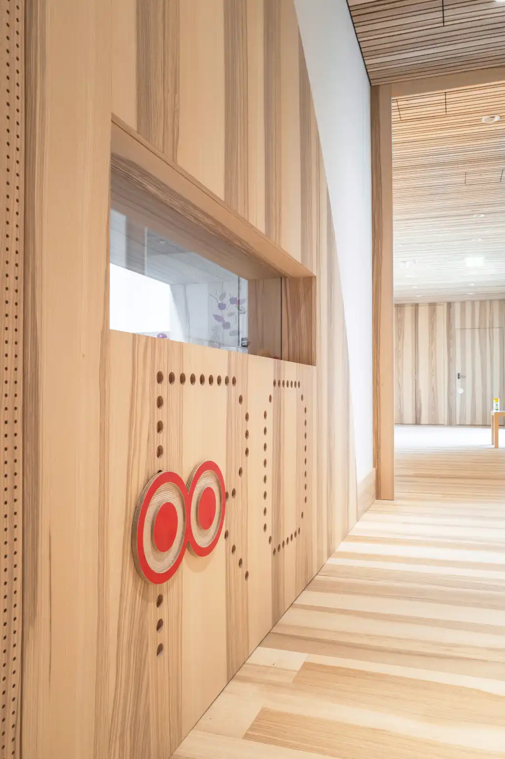
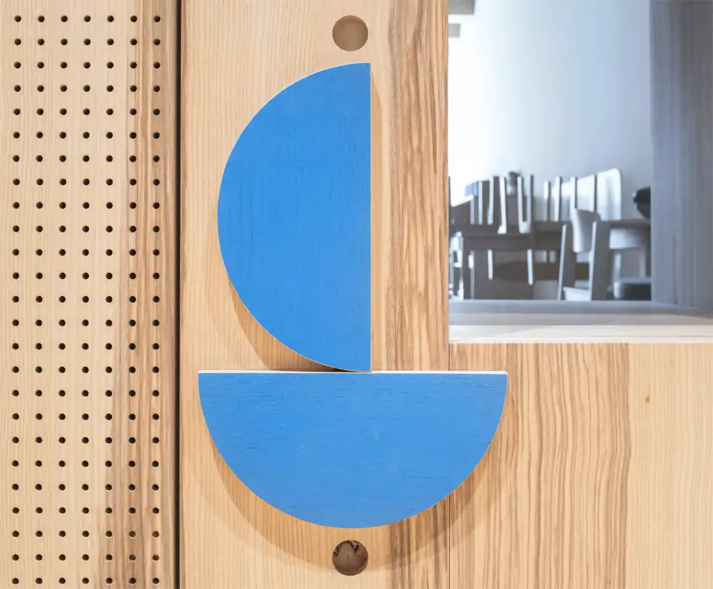
These two-letter terms designate the various functions of the rooms in the building. However, it's the combination with graphic symbols that makes them easy to remember for both children and adults. To draw attention to this sign system and encourage playful interaction, changeable pictograms have been installed at child-friendly heights. For example, in the central dining area, colorful discs on a plate invite rearrangement into shapes like flowers or emojis. In the sleeping areas, there are eyes that can open and close. In the sports and activity room, a spinning soccer ball is featured, while the oasis area showcases letters "riding" on waves.
Summed Up
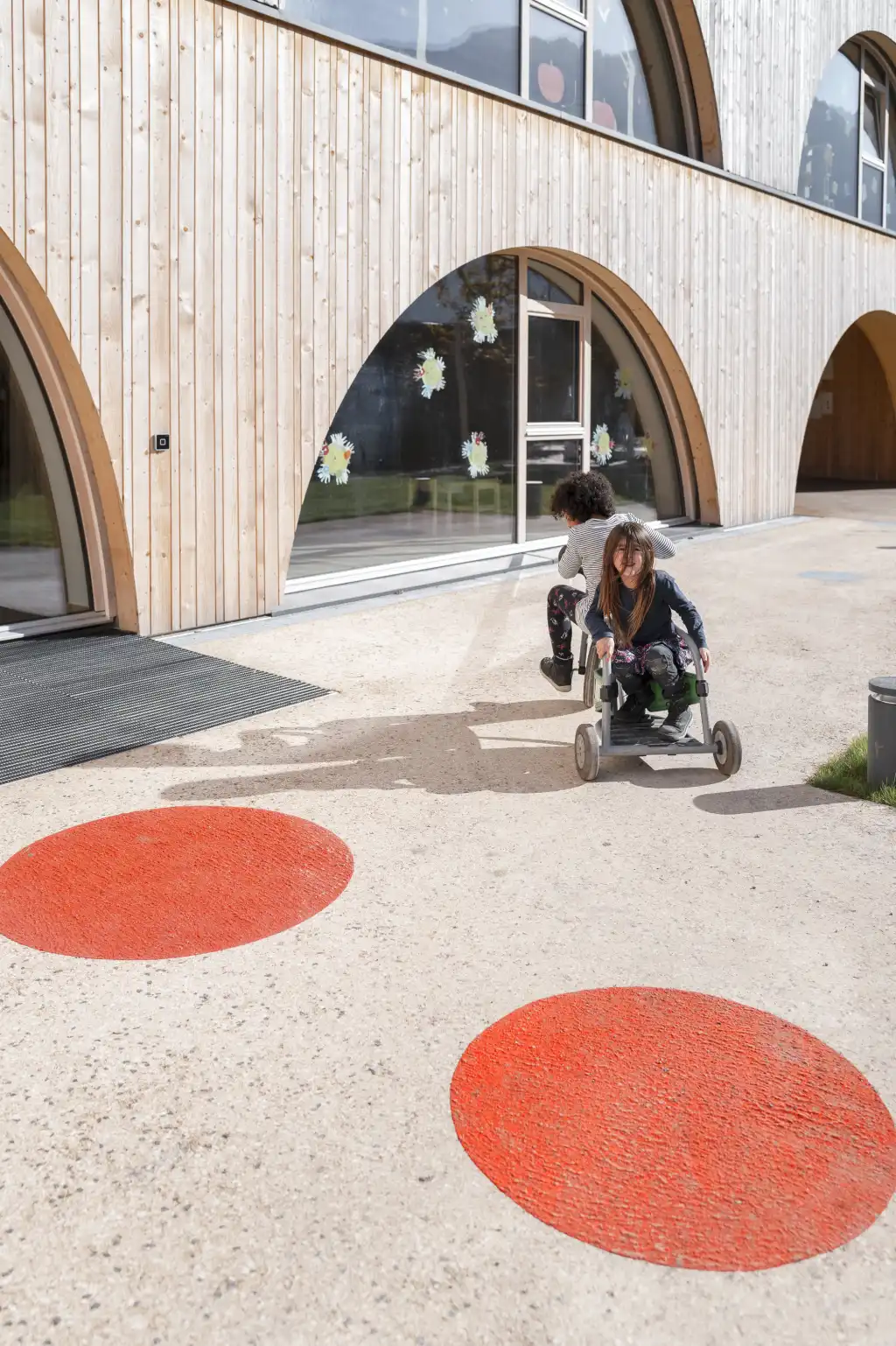
The building is spatially organized into four diagonally offset "houses" running from west to east. To aid orientation, the main entrances and rooms for the three different child groups are marked in the primary colors red, blue, and green. Wayfinding begins even before reaching the building: in the nearby underpass, large dots on walls and ceilings grab attention. Additional dots appear as floor markings on sidewalks, in the parking lot, and along the path to the center.
The sign design by Atelier Andrea Gassner seamlessly integrates visual and verbal elements into the architectural concept. Here too, the playful, colorful guidance system fits naturally into the overall design, adding an imaginative accent and extending the story of this new communal living space in a creative way. The overarching goal is to significantly enhance the identification and connection to this positive space for children and families in Nenzing.
