Ingenbohl Convent Retirement Centre
Between Moutain und Sea
| Title | Ingenbohl Convent Retirement Centre |
|---|---|
| Year | 2024 |
| Client | Kloster Ingenbohl |
| Architecture | Boltshauser Architekten |
| Production | Grafe AG |
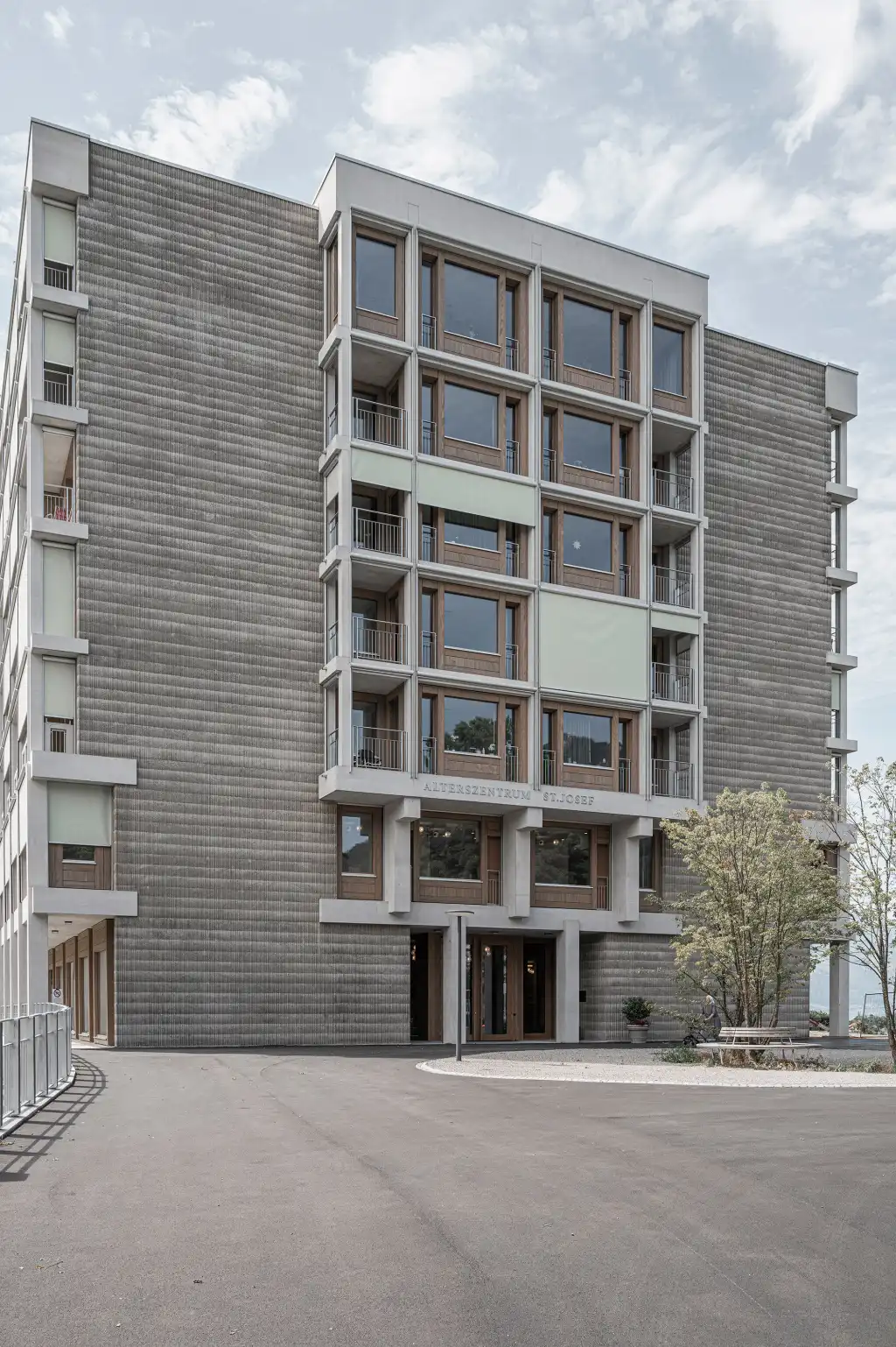
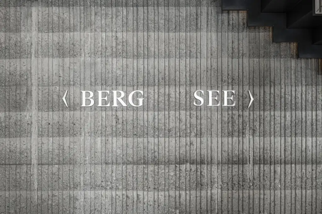
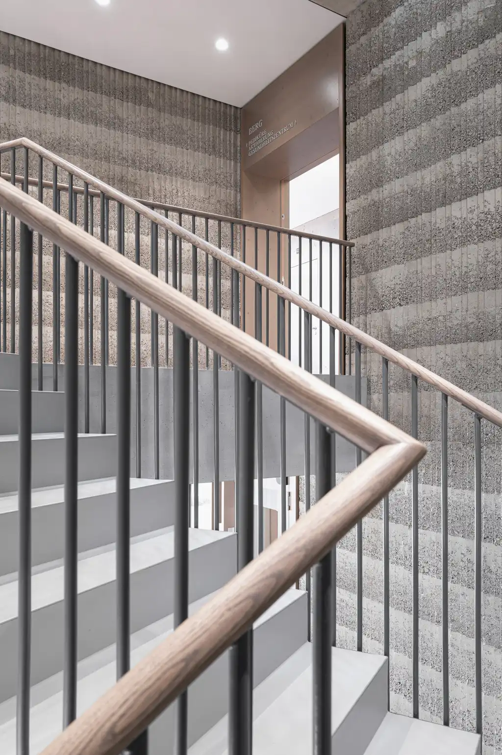
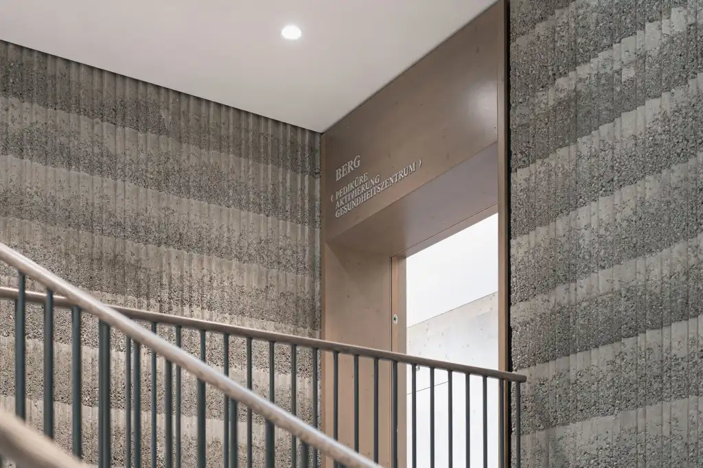
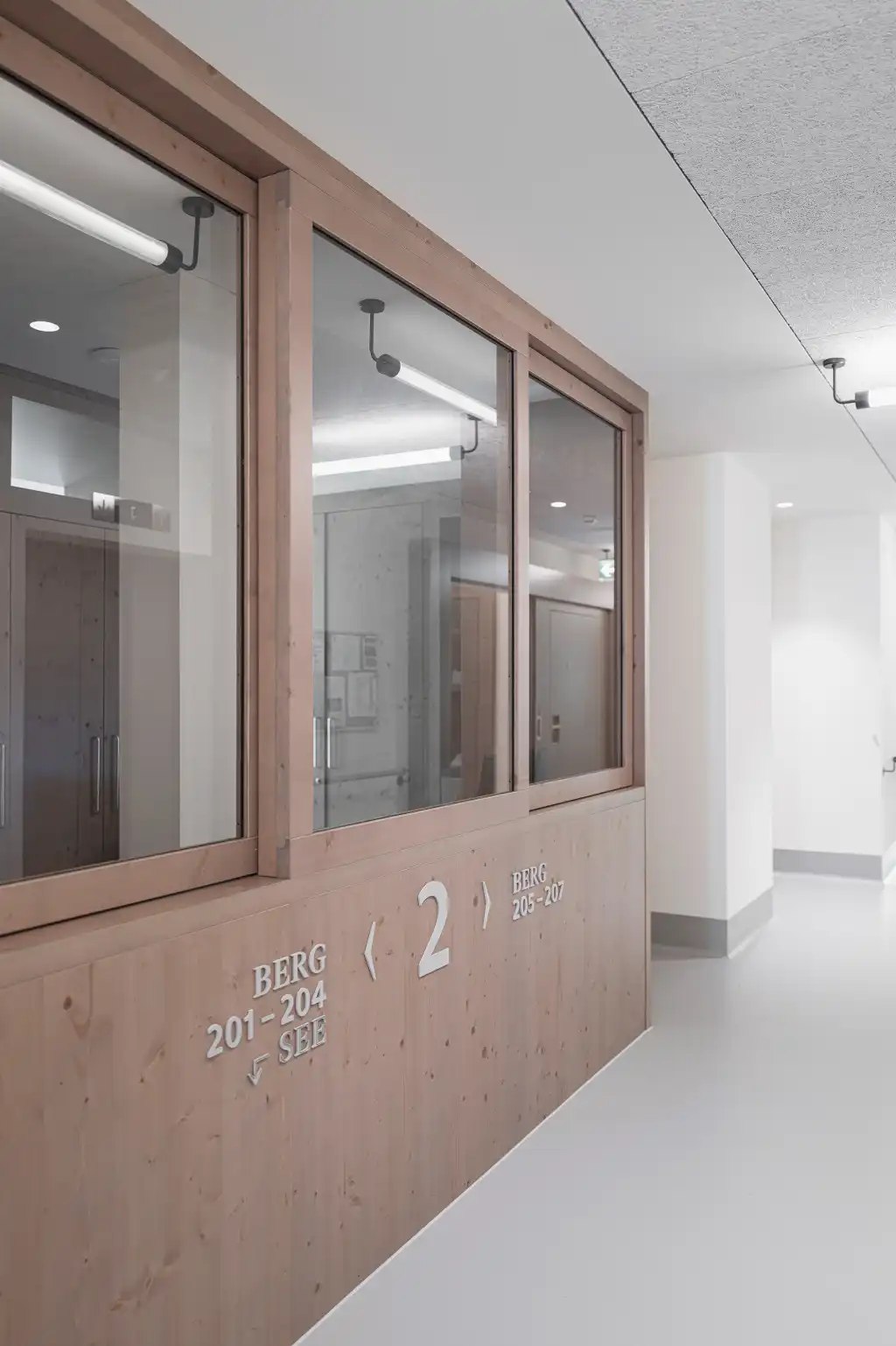
Showing neither trepidation nor any form of banal showmanship the blocky new building by Boltshauser Architekten on the slopes of the hill occupied by the convent gives the existing buildings a modern stamp. The vertical plane draws its strength from the distinctive layering of the building in storeys above the plateau and the basement floors, which are visibly anchored in the slope. Through the privileged position on the plateau two almost complementary visual axes are established to the east the mountains, to the west Lake Lucerne. The design concept for finding the way around the building is based on this complementary pair and uses the semantics of the words “Berg” (mountain) and “See” (lake) to facilitate orientation in the principal directions inside the building.
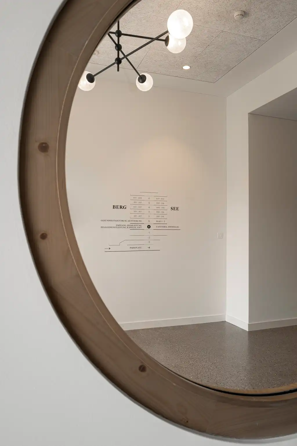
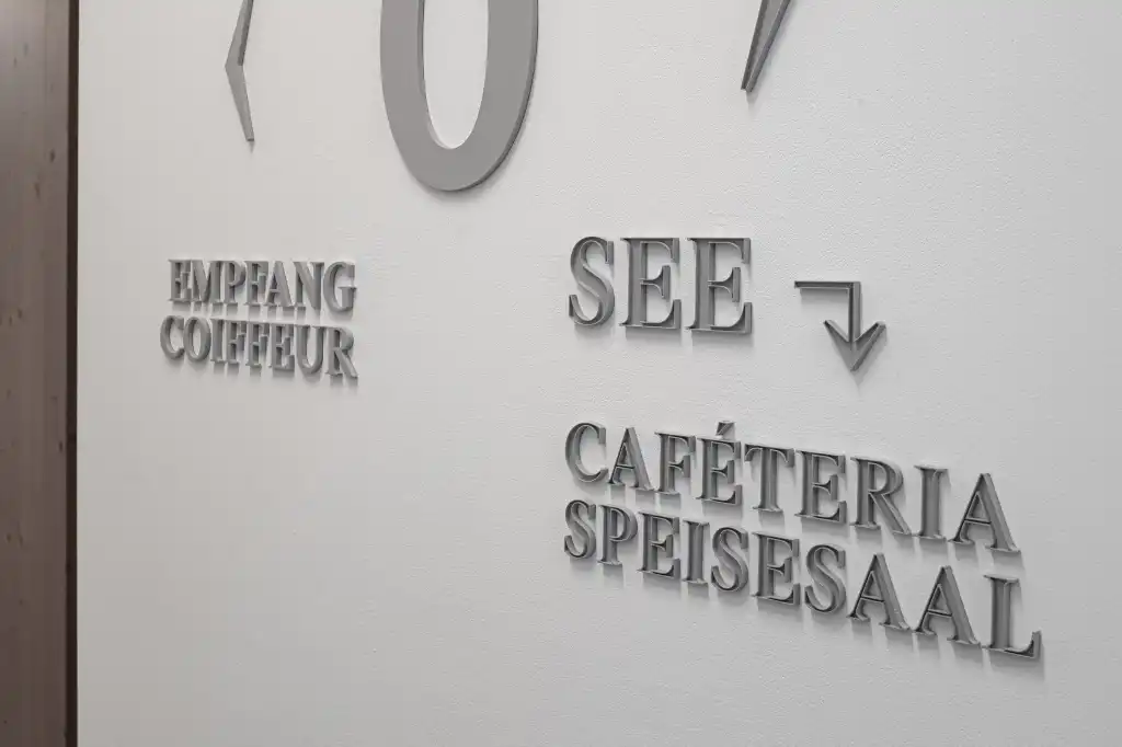
These terms are subtly reflected by the typography and layout. While the numbers, symbols and lettersthat refer to the lake side are hollowedout, like vessels, those that relate to the side of the building facing the mountain are full and corporeal. On the different storeys the information about which rooms are to be found on the respective floor is mounted in two lines: the word “Berg” is placed above the line with the room numbers, whereas the word “See” is positioned below thenumbers.
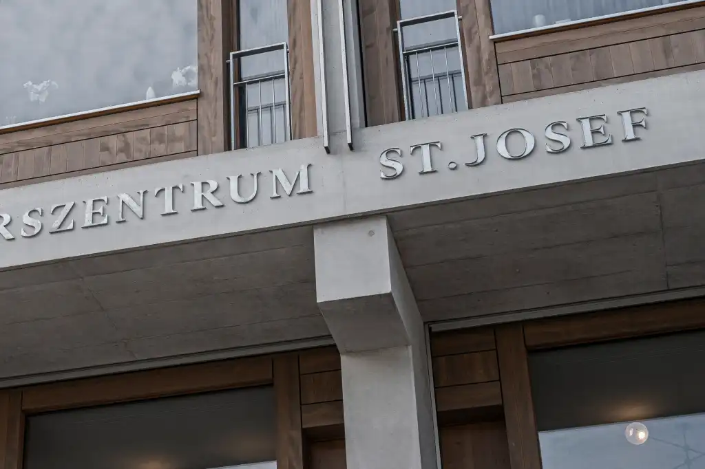
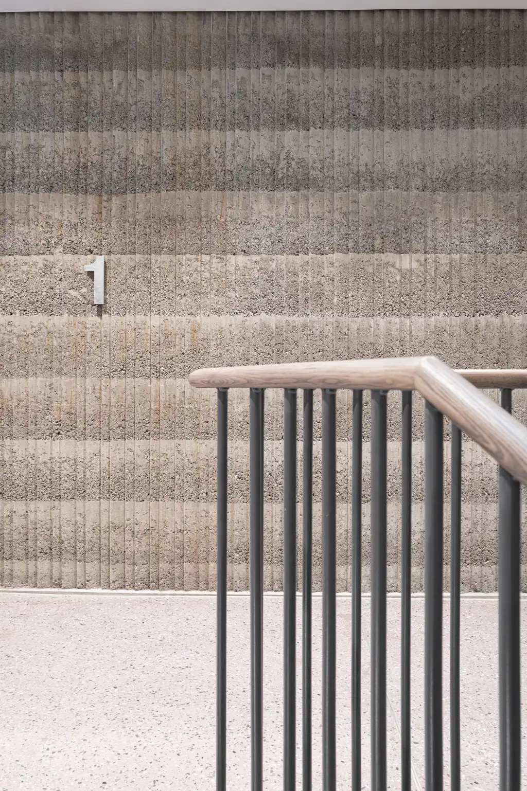
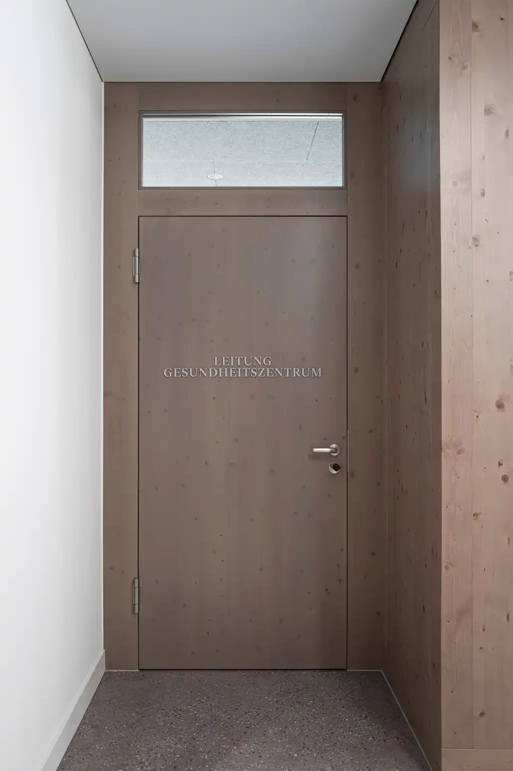
A high-quality typeface family with different weights was chosen for the numbers and the lettering – ranging from the classic Antique with bold capitals to sans serif Linear Antiqua – and was used flexibly. The design is intended to reflect the dignity of this order of nuns thatis more than 150years old while also meeting the need for legibility and a contemporary aesthetic. To employ the same language as the architecture the materialisation harmonises with the canon of materials and colours used in the building. The lettering for the outdoor signage on the trass lime facades is made of sanded and galvanised iron, while inside the building the lettering, which is mounted on a variety of materials, is made of colourless matt acrylic glass. The typographical layout is generally axial and conveys a sense of calm and serenity. The plans that help you identify your location and to find your way around the building have a surprisingly unfussy and unornamented character. They resemble tabular typesetting, which, thanks to the use of lines, almost automatically transforms into a cross-section through building, while at the same time providing the overview and orientation required.
