86
Christoph Binder
Publication Image for Consultation in an Intercultural Context
| Title | Christoph Binder |
|---|---|
| Year | 2018 |
| Client | Dr. Christoph Martin Binder |
Dr. Christoph Binder’s core area of competence lies in assisting small and medium-sized businesses aiming to internationalise their business. He communicates his knowledge and intercultural experience through reflective personal mentoring processes for staff and managers who wish to or must prepare themselves for deployment abroad.
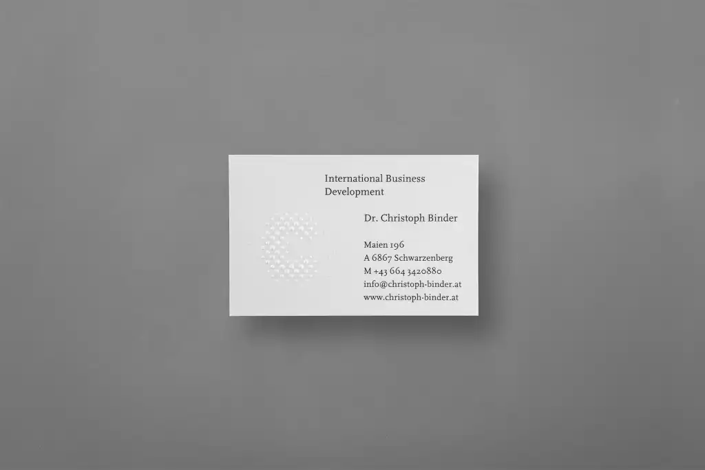
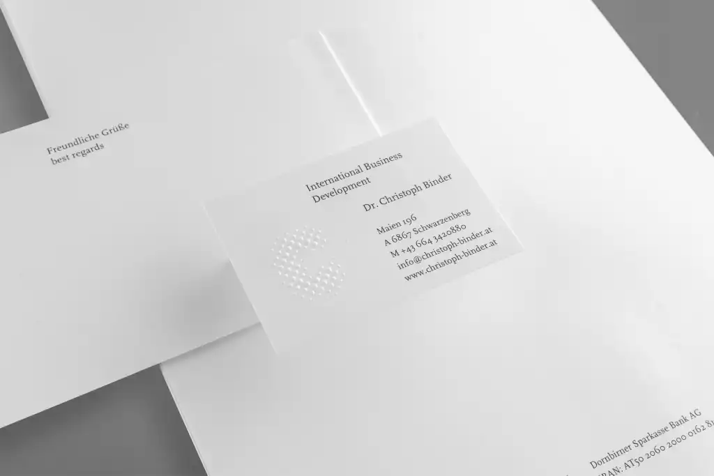
We placed the rounded, open “C” as a visual anchor at the centre of image. The dotted form symbolises the multi-national network of the business. When used digitally, the rows of dots in the logo are distinguished from each other by different shades of grey and sizes and can be activated by a cursor reaction. Alongside the symbol’s interactive »usability« the effect is a surprisingly three-dimensional development. In the printed form through the sharp-edged blind embossing the logo appears tactile, spatial and at the same time elegant. In typographic terms the logo is framed by type cuts from the typeface family »Scala« – a reinterpreted serif-stressed Renaissance-Antiqua by Dutch typeface designer Martin Majoor.


